
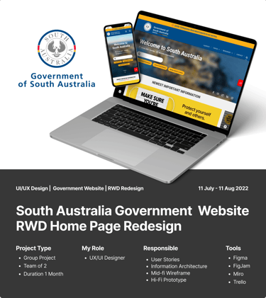
South Australia Government Website | Redesign Case Study
UXUI | Government website | RWD
DESIGN
9/16/20228 min read
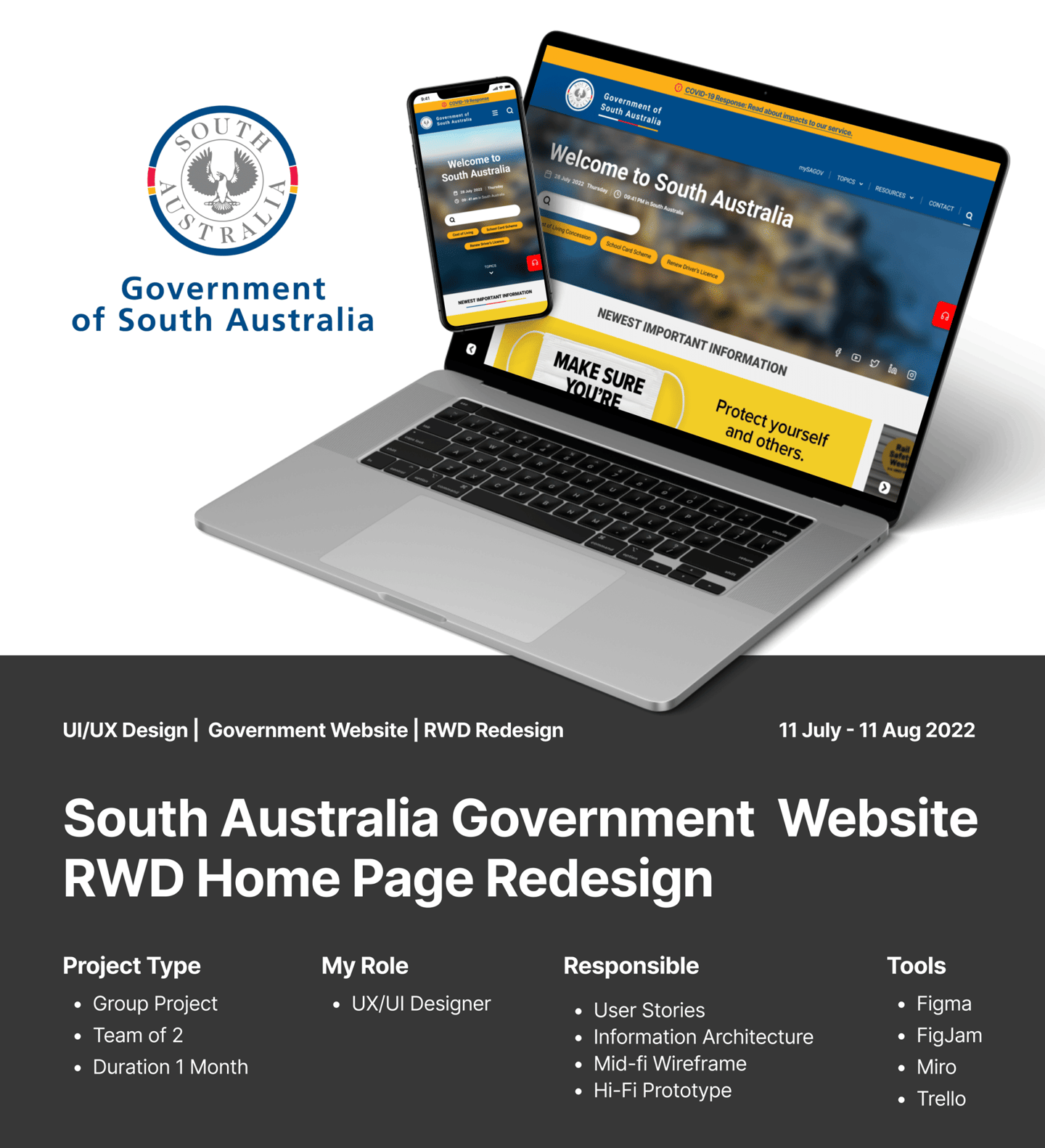
Project Overview
01 | Objective
The team wanted to redesign the existing user experience on the South Australia Government website.
02 | Role & Deliverables
In this project, I worked closely with a teammate, my instructor and a TA. I was responsible for the UX and UI design, from defining the problem to delivering the HiFi visual artifact.
03 | Challenges
According to user interviews in the early phase of this project. We found out that not many people know about this website in the first place, the colour scheme was poor and that it doesn’t really look like a state government website. The existing SA.GOV.AU website didn’t use the official South Australia Government emblems or was properly titled so users were actually unsure as to whether they were visiting the correct website.
04 | Outcome & Impact
The current iteration that I have created makes for a much more professional, trustworthy and clear online image. It strengthens the connection between SA residents and their government by giving them easy access to state government services.
Background
The current SA.GOV.AU
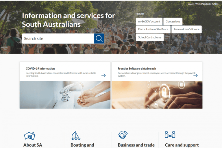
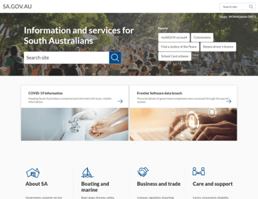
SA.GOV.AU is a Government official website for South Australian citizens and businesses to find government services and information. The site is managed by Office for Digital Government in the Department of the Premier and Cabinet. Their goal is to work with the rest of the government to make things clear, simple and easy. It’s a big task, and many people from every department work with them to link up government services and present things in a consistent way using plain language. Their standards and guidance support this work.
Process
This case study was created as part of my User Experience Design qualification at Monash University. This course was a great opportunity for me to upgrade my UX and UI skills. As part of the course, I had several assignments, including major projects that spanned several weeks.
Week 1
Creating a proto-persona
Defining a user path from a website analysis
Executing a heuristic evaluation of a website
Conducting user tests
Building a mood board with InVision
Week 2
Analyzing the navigation of a website from a heuristic perspective
Running usability tests on the navigation of a website
Performing card sorting
Redesigning a new sitemap using Figma or Adobe XD from card sorting results
Creating a sitemap for navigation
Prototyping a brand new navigation UI based on a sitemap
Week 3
Creating and iterating on header and footer navigation components for mobile and desktop
Wireframing a homepage and navigation system for both mobile and desktop
Creating a clickable prototype for a website and its navigation
Running a five-second usability test of your clickable prototype
Applying visual design to a homepage mockup using a UI style guide that you created
Week 4
Designing and applying a style guide to the design of a responsive homepage for both desktop and mobile screen states
Iterating responsive wireframes for desktop and mobile
Creating clickable prototypes of a homepage design for both desktop and mobile
Planning and executing a usability test for a mobile homepage design and navigation
Iterating a design from testing feedback
Building a case study that conveys the full scope of your design process
EXPLORE CHALLENGES
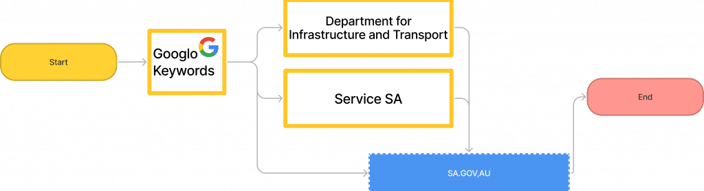
The primary funnel entry to the website is via Google searches bringing users to 3 primary websites; the Department for Infrastructure and Transport website, the Service SA website, and the SA.GOV.AU website.
The main service page to renew motor vehicle registrations is located on SA.GOV.AU.
But when people visit the SA.GOV.AU website, they get stuck and doubt if they are on the right track because the website doesn’t look like a government website. It doesn’t have the official government emblem or any official-looking header on the homepage. So people waste time searching around and feel tired about it.
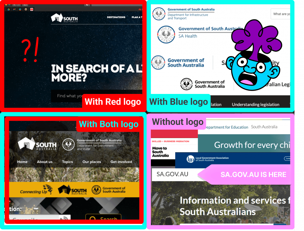
This insight from our user feedback took me down a rabbit hole. I extensively researched the web presence of various departments of the South Australia Government found that there is very little branding consistency in terms of logo, colours and layout. It is hard to tell they are from the same family under the South Australian government.
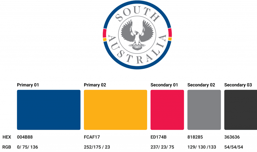
Users can become confused as to what is South Australia government’s embelm. Some departments use the red one, some use the blue one, Some use both, and some didn’t use the logo at all.


Defined User Path
Some common pain points from the interviews:
Not many people know about the SA.GOV.AU website.
The colour scheme was poor and that it doesn’t really look like a state government website.
The existing SA.GOV.AU website didn’t use the official South Australia Government emblems or was properly titled so users were actually unsure as to whether they were visiting the correct website.
PROBLEM STATEMENT
When Emily was looking for information on renewing her motor vehicle registration in South Australia, she found 3 websites that might provide the service: the Department for Infrastructure and Transport website, the Service SA website, and the SA.GOV.AU website which was quite confusing for her.
How might we provide a better user experience for Emily in order to assist her in renewing her motor vehicle registration?
Principles
The following principles are what I complied when I was designing the new experience:
Consistent
I would like to align user experiences across government agency websites at the foundation level to make sure that we have relatively consistent experience across departments, devices, and services.
Accessable
The demographic age profile of users of a government website is wide. So even though our target user in this project is around 18~50, I would like to make sure it could be as friendly as possible for children to elderly people. Also, there are a lot of content and services on the south Australia government website, I would like to make sure the navigation is intuitive, and present the important function in the way they used to see it.
Clear hierarchy
A clear hierarchy could help users navigate our website easily. Reduce the common anxiety of our users about searching for information on the government website. Moreover, Government could communicate with users more efficiently.
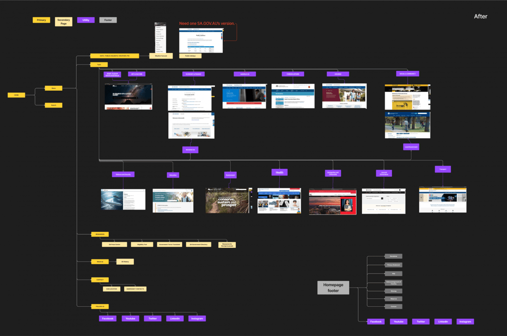
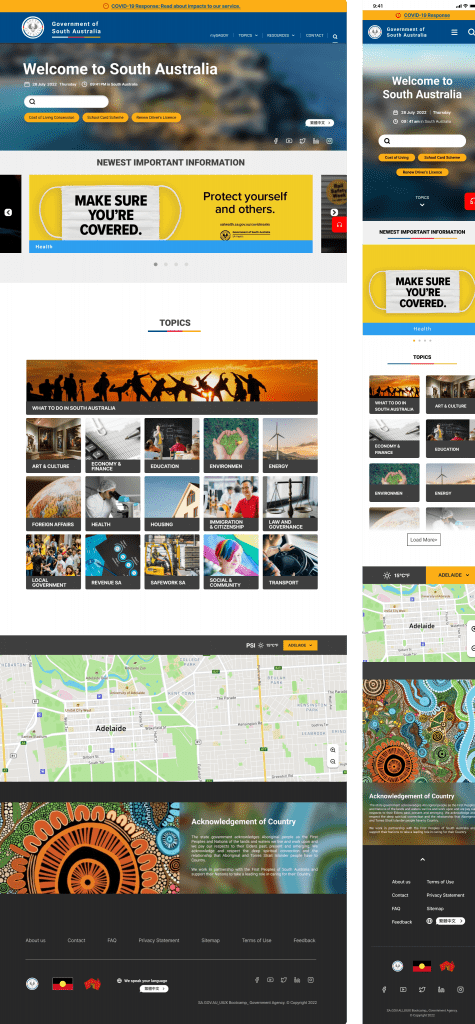
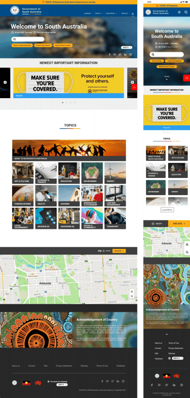
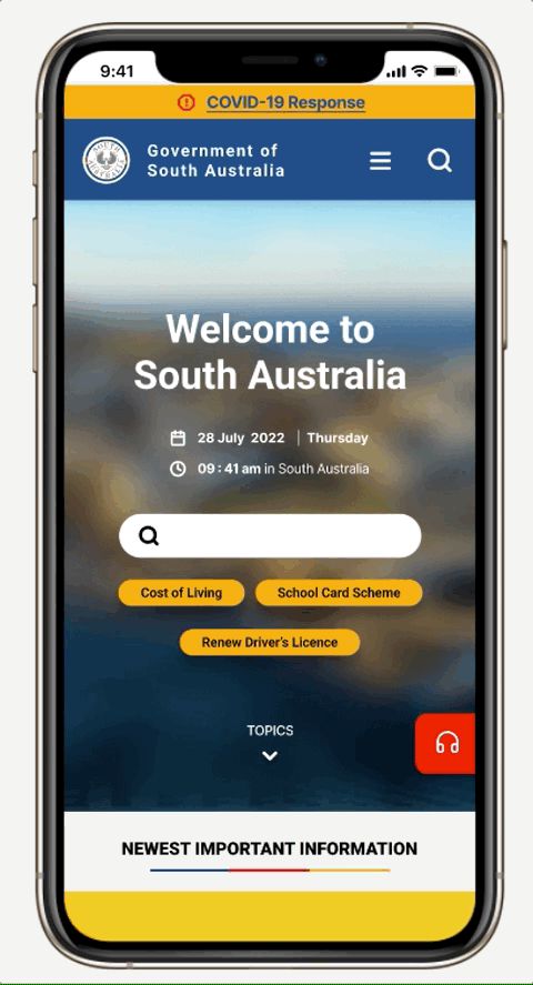
NEW WIREFRAME ANNOTATION
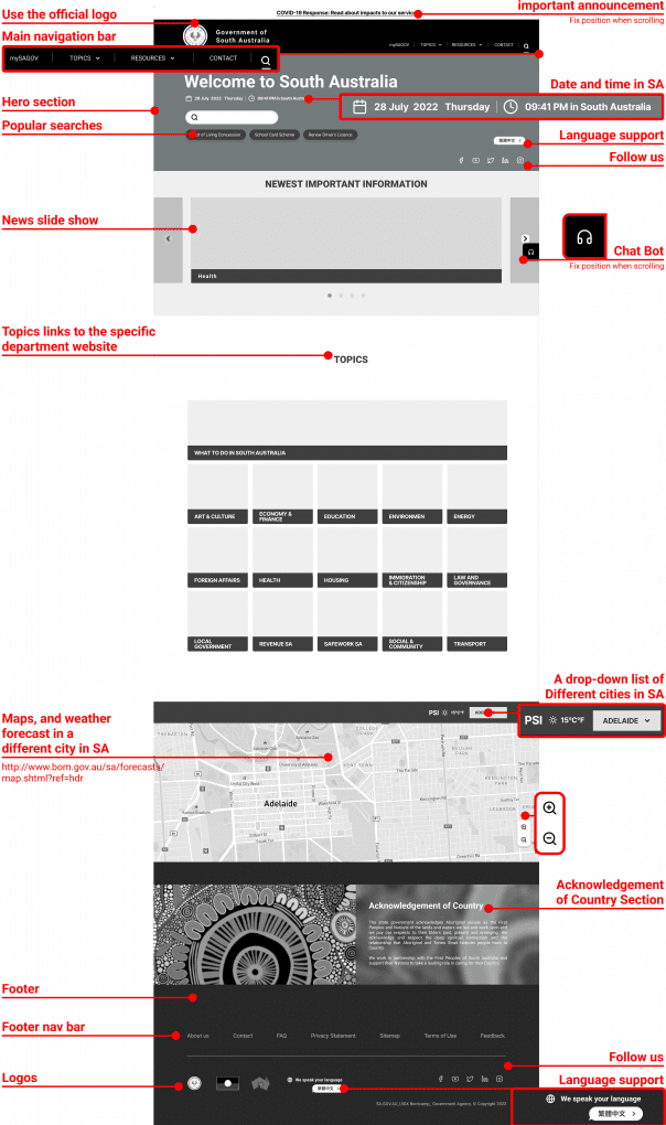
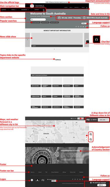
The contents and concepts of the new wireframe decision
Header
Important announcement
SA logo
Main navigation bar
mySAGOV / TOPICS / RESOURCES/ CONTACT/ SEARCHChat Bot
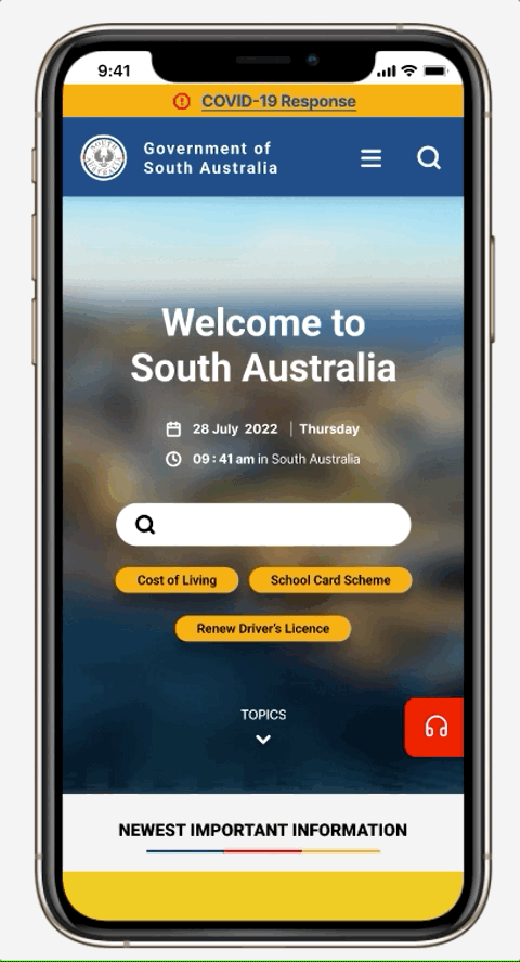
Hero Section
The hero section on the homepage is the first impression to the website visitor. It could have a big impact on the next steps they are going to take.
I believed that we provide a professional, trustworthy, and clear online image to our users would help them have more confidence in the whole searching experience, then increase their will to use government online services in the future.
This is one of the following testing objectives that I would like to find out in the future.
Date and Time
Users could visit from anywhere in the world, I assumed that providing the date and time in South Australia would help our users better when they visit our website.
Search bar
Popular searches
The reason that people visit our website in the same period of time might be similar. I assumed that providing the popular searches would serve our users better when they need to find some specific service or information.
Language support
Australia is a multi-culture county. I assumed that providing language support will serve and communicate with our users better because they might not really be familiar with English yet.
Follow us
I assumed encouraging people to follow our other social media would help our users to get the first important information in order to serve people more efficacy.
Important News slide show in SA that colored tags in different topics and departments.
I assume people would like to get the overall South Australia news on different topics from one page. The banners of this slide show could import from other departments of the South Australia Website.
Topics
LATCH Organizing Scheme Principles: Category/ Alphabet/ Hierarchy
WHAT TO DO IN SOUTH AUSTRALIA (Activities)
ART & CULTURE
ECONOMY & FINANCE
EDUCATION
ENVIRONMENT
ENERGY
FOREIGN AFFAIRS
HEALTH
HOUSING
IMMIGRATION & CITIZENSHIP
LAW AND GOVERNANCE
LOCAL GOVERNMENT
REVENUE SA
SAFE WORK SA
SOCIAL & COMMUNITY
TRANSPORT
Map
I assumed that it would serve users better if we put maps and weather forecasts on the homepage of SA.GOV.AU. This is one of the following testing objectives that I would like to find out in the future.
Acknowledgement of country
In the previous research, I visited different Australian government websites and I found a lot of them have this section to show respect and appreciation of the Aboriginal cultures. I assume if we align the experience with the other Australian government agency websites to provide a relatively consistent experience would serve our users better.
Footer
Footer nav bar
About us/ Contact/ FAQ/ Privacy Statement/ Sitemap/ Terms of Use/ Feedback
Logos
Follow us
Language support
COLOR PALETTE
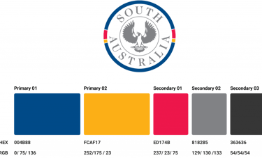
The color palette for this website is aligned to the South Australia logo to show consistency and harmony.
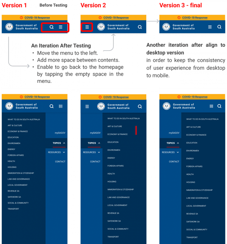
MOBILE USABILITY TESTING
Mobile Header layout Iteration

HiFi wireframe
Mobile Prototype
Learning & Takeaway
Learning to redesign the South Australia Government website was a fun, challenging process. I found that a bunch of different departments under the state government have their own websites to provide specific services, but those websites don’t have the same logo or layout which makes the “Consistency” of the overall impression of online service look weak.
Additionally, reflecting on our previous user research and testing, I assumed that users don’t need repeating information from the main state government website if there are some specific websites for that topic. Therefore, I believe it would serve users and organizations better if we iterate SA.GOV.AU as a hub for all relevant utility links and a launch point for the newest information, eligibility tool, multi-language support, etc, instead of having an extensive service menu as our main navigation on the homepage.
The main iteration I would like to work on for SA.GOV.AU is to assist the South Australian Government to have its professional, trustworthy and clear online image. Strengthening the connections between residents and the government would help the state government provide services more efficiently.
However, in this project, we didn’t get the chance to talk with stakeholders, so all of the challenges I discovered and ideas of iterations are just assumptions that I think might be valuable to work on. However, this hypothesis still needs to be tested to see if my assumptions are correct.
You may also like
Artmigo acknowledges the Wurundjeri Woi-wurrung people, traditional custodians of the land we live, work & create in. We pay respect to the Elders, past, present & emerging.
© 2025 Artmigo. All rights reserved.